I was recently featured on Blue Sun Studio, Inc. for a website critique by Deb Dorchak and Wendi Kelly, two amazing web designers (and authors to boot). This was exactly the kick in the butt I needed to make some big changes to my website. I ended up updating my existing theme instead of purchasing a new one on the Genesis framework. If I couldn’t get my existing theme working good, I was definitely going to switch, but I had some great support in updating the current one, so it stays for now.
I followed Deb’s advice to streamline, clean up, highlight the art/photos more clearly and boldly with sliders, and remove the overbearing “black line” feature header bar on pages that didn’t have a slider.
It is definitely NOT finished, but I think I’ve got a good start so far. All of this changing and updating inspired me to paint a new logo for my site too.
See full critique here (plus a before screenshot of my website).
THANK YOU Deb and Wendi.
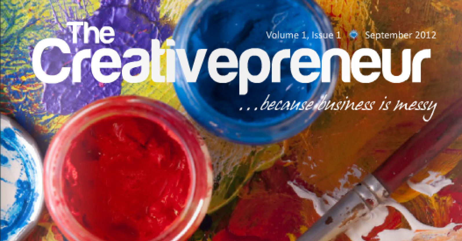
OH, and if you want to read an awesome online magazine catering to creative entrepreneurs, Deb & Wendi have published The Creativepreneur just for you. I personally love the magazine and enjoy waiting for the next one each month. Here is the link to all of Blue Sun Studio, Inc.’s publications: http://issuu.com/bluesunstudioinc


One Response to Blue Sun Studio Critiques my Site + The Creativepreneur